Printer-friendly version
Author:
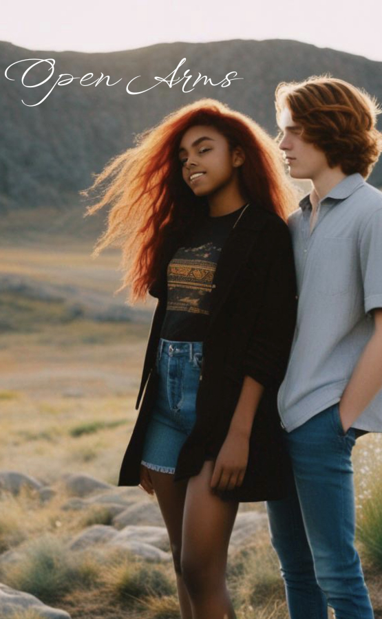
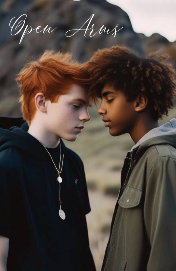
I’m working on the third book in a series and wanted to know which picture looks the best.

TopShelf TG Fiction in the BigCloset!
I’m working on the third book in a series and wanted to know which picture looks the best.
Checks can be made out & sent to:
Joyce Melton
1001 Third St.
Space 80
Calimesa, CA 92320
USA
Note: $6000 is the operating, maintenance and upgrade budget. Amounts received in excess of the $6000 will be applied to long term debt accrued over the last 19 years.
If you prefer, you can donate through Patreon:
Become a Patron!
Thank you!
Comments
Face to Face
looks so much more personal.
Love, Andrea Lena
Agreed
Face to face.
Her Crowing Glory
So many things define a male and a female. Hundred if not thousands of things we consciously never think of but our subconscious registers it all. I have always believed from the time I knew there was boys and girls, "her" hair was her crowning glory. Beautiful women with short hair may look cute or beautiful. Yet..., a woman with long beautiful hair will always be the one.
The design of a book cover is usually more important than the best story we ever read hidden behind that cover. The reader has to be interested enough to pick the book up or if it's electronic, to sample the blurb inside. A thousand individuals and the author is trying to appeal to the largest numbers. Tricky, even the best publishers haven't solved that problem. Sampling your readers for a cover before publishing is a new one and I like the idea.
Hugs Aylesea
Barb
When I finally knew everything is when I understood I knew nothing.
Oklahoma born and raised cowgirl
I Prefer the Top One...
With "arms" in the title, the shot that includes them (even though they're not particularly open) seems a little more appropriate.
And Barb may have a point about the long hair.
Best, Eric
I prefer the first image.
Four things,
First, I like the long hair on the girl.
Second, I love the backlighting, the light shining through their hair creating a halo effect.
Third, I prefer the background in the first picture. In the second picture, I think the background is too blurred; blurred too much in comparison to the people who are in sharp focus. To me it makes the image look very artificial. Similarly, the edge of the hill where it touches the sky looks fake to me.
Fourth, the second image leads me to think that the two boys are gay, which is fine if the story is about a gay couple, but the first cover would (for me) better suggest a TG couple.
Lindsay
Agreed…….
For all of your reasons, but most prominently I agree that the lower picture gives the impression that the story is about two gay boys. If that is the intent, then go with that one.
Personally, I have no problem with the story either way - but if a person is specifically looking for a TG story the picture might turn them off.
D. Eden
Dum Vivimus, Vivamus
I have to agree
I have to agree with those voting for the first (top) picture. I agree with all the reasons stated by those other fine folks.
Hugs
Patricia
Happiness is being all dressed up and HAVING some place to go.
Semper in femineo gerunt
The second one definitely
The second one definitely says "two boys" to me. If that is not who the story is about, that would be a major problem.
I 'vote' the top picture ...
... the brunette looks reasonably happy, the blond is holding them (I think - right arm is behind.)
-
The second, bottom, looks like a really intense moment, with 'captions' saying anything from "Can we be Just Friends?", to "We will get through this, Together.", or even "You can't pass Math class if you go clubbing every night."