
Author:
Blog About:
Taxonomy upgrade extras:
This book, barring any unforeseen calamity, should be ready later this week. Would you give me your opinions on the cover you like best.

Also, here is the book blurb... I will take suggestions and recommendations.
Janice Rosenthal is entering her eighth year of teaching, but it might be her last. Never before has she had a student as unruly and insubordinate as this one. Andrew Bryant is the terror of seventh grade, a student known for driving teachers to the edge of retirement, and he is in her class.
How can Janice--and the rest of her students--make it through the school year with such a disruptive force in the classroom? Her only hope is to try to break through the orphan's defenses, to pierce a wall that no other teacher has ever scratched.
When she discovers Andrew's secret, two lives will be changed forever.
Comments
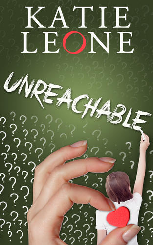
the cover
I like the first one
of the two
the first is better
Madeline Anafrid Bell
Not shure of the covers
My gut feeling:
The second cover is rather steril and impersonal. The lettering is very straight. And the table and chair standing in the water have no real context reference. The blurb talks about a student and a teacher, that is 2 persons / humans with real issues. Nothing of that seems to come through the cover for me.
The first cover is rather more dynamic (though also somwhat artificial). The skewed "O" in the author name, together with the different color, suggests movement and that something will happen. The font of the title, as well as the slant, suggest that nothing is as clear as it would seem at first sight. All the interrogation signs make me wonder what is going on, in the background (the more faded) the more covert issues and in the foreground the more overt questions. The person with the chalk indicates that the story is set predominately in a school setting. So far I feel very good about that graphic.
My personal issue is with the obviously photoshoped hand sticking the "heart-magnet" on the "students" back: That caught my first glance, and it caused an almost violent gut reaction because of the bullying I suffered in my school years.
If the intent is to show the eventual love the teachers develops for her student, an open hand that cradles the person from the front would be a better image. To gain the trust of a person, before they will trust you to have their back, you have to approach them from the front.
Katie, you asked for our opinion. I could not just say that one is better than the other. I felt the need to explain what these images do to/for me, so that you can make a better decision for your choice of cover. In the end, it is your book, and it is your choice of cover that will be published. And I actually would like to read this story, based on your previous works here on BCTS and the blurb you posted.
All the best in your endeavours!
Jessica
The second
I like the second better. It's less cluttered and leaves the viewer wondering what is going on. The first one is good, too, but it is a bit heavy-handed with the question marks and the heart. Also, the photoshopped hand has a partial white outline which detracts from the impact of the image. I don't know which one fits the story better, though.
The second image has more impact. Anyone who sees that will remember it. The other feels pedestrian by contrast.
Hugs,
Erin
= Give everyone the benefit of the doubt because certainty is a fragile thing that can be shattered by one overlooked fact.
I Prefer the First...
...the second just doesn't do anything for me. Sort of the difference between an active and a passive statement.
Eric
I like the first cover
It gives me hope.
The second is...lost, abandoned, alone. So alone that there isn't even the lost child in the picture. Perhaps that is how the book feels at its start, but I wouldn't codify that emotion into its cover. Too bleak. Even in some of the covers for High Fantasy where the Evil Ones seem about to utterly triumph, there is a spark of hope.
So give us hope, Katie. Just as your stories do for us.
SuZie